
Working with the Collection Details Pattern in Oracle Redwood
In this article, we’ll walk through how to use the Collection Details pattern in Redwood with Oracle Visual Builder.
The Collection Detail Page Template component is designed to organize and present lists, while also displaying the details of selected list items inside a dedicated detail panel. It also provides advanced features, such as stacking item details when multiple selections are made.
The Collection Detail Page (oj-sp-collection-detail-page) is a page-level template component that enables developers to combine a list view, a detail panel, and a stacker within the same layout.
This component is divided into four main sections:
-
General Overview Header – serves as the top area for actions like save, cancel, navigating back to the parent page, or moving to the next items.
-
Default Slot – positioned below the header, it holds the
oj-sp-collection-containercomponent which displays the main list. -
Detail Template Slot – placed alongside the default slot, it includes the
oj-sp-detail-panelcomponent responsible for showing detailed information of the items selected in the list. -
NoSelection Slot – also located beside the default slot, it specifies the content to be shown when no list items are currently selected.
- Develop a VB Application by entering the application name and choosing the Redwood Starter Template from the available options, as shown in the following screenshot:
 2. When crafting a VB application utilizing the Redwood Starter Application template, it generates a ‘vbredwoodapp’ with the default flow set to ‘main’.
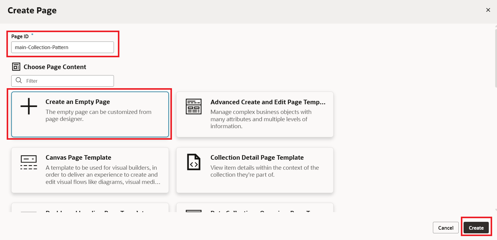
3. Click on +icon beside the main and select Create Page as shown in the following screenshot: 4. A dialog box will prompt us to input the page ID. Select +Create and Empty Page and click on the Create button as shown in the following screenshot:
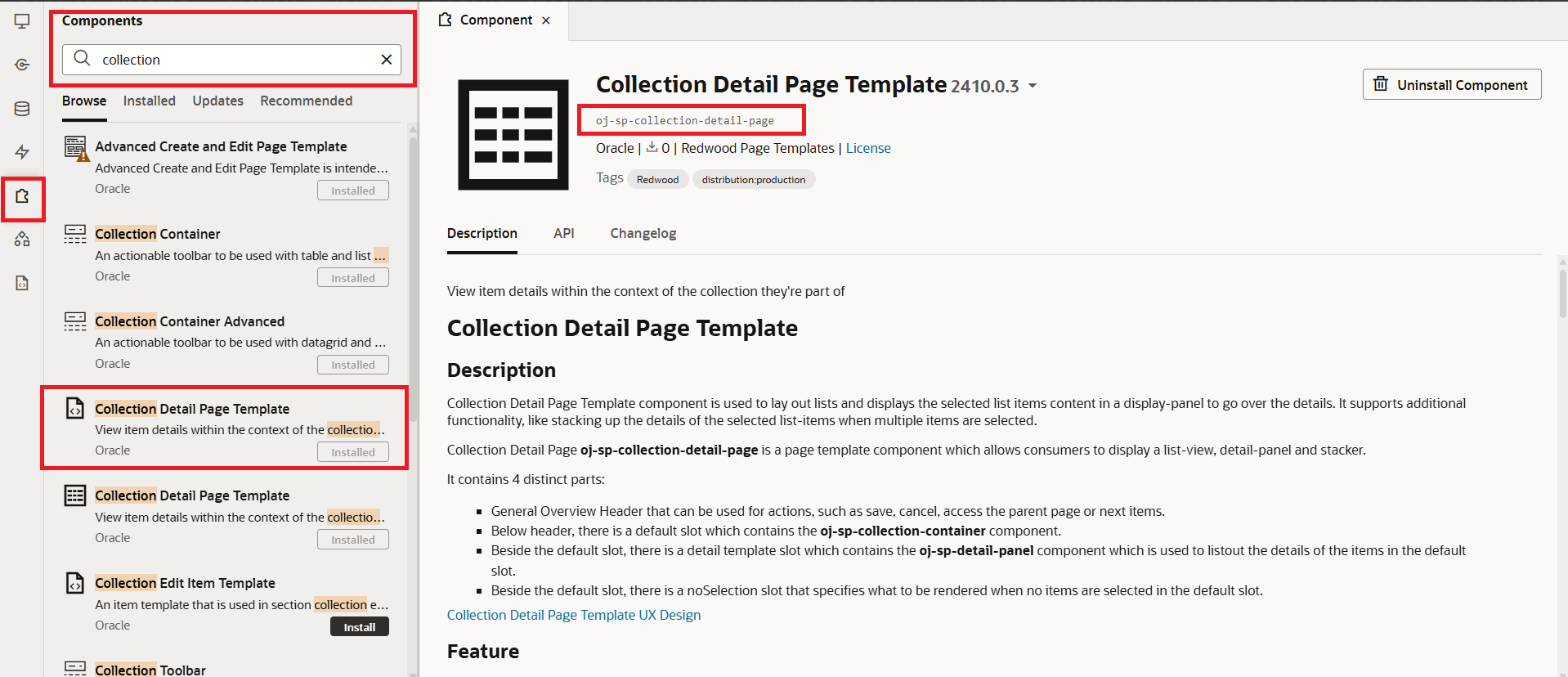
 5. By navigating to Components Exchange and searching for a collection, you’ll be able to view all the available templates and patterns. From there, selecting the Collection Detail Page Template will provide access to its full documentation.
 Next, copy the template tag from the documentation and return to your collection pattern page to use it there.
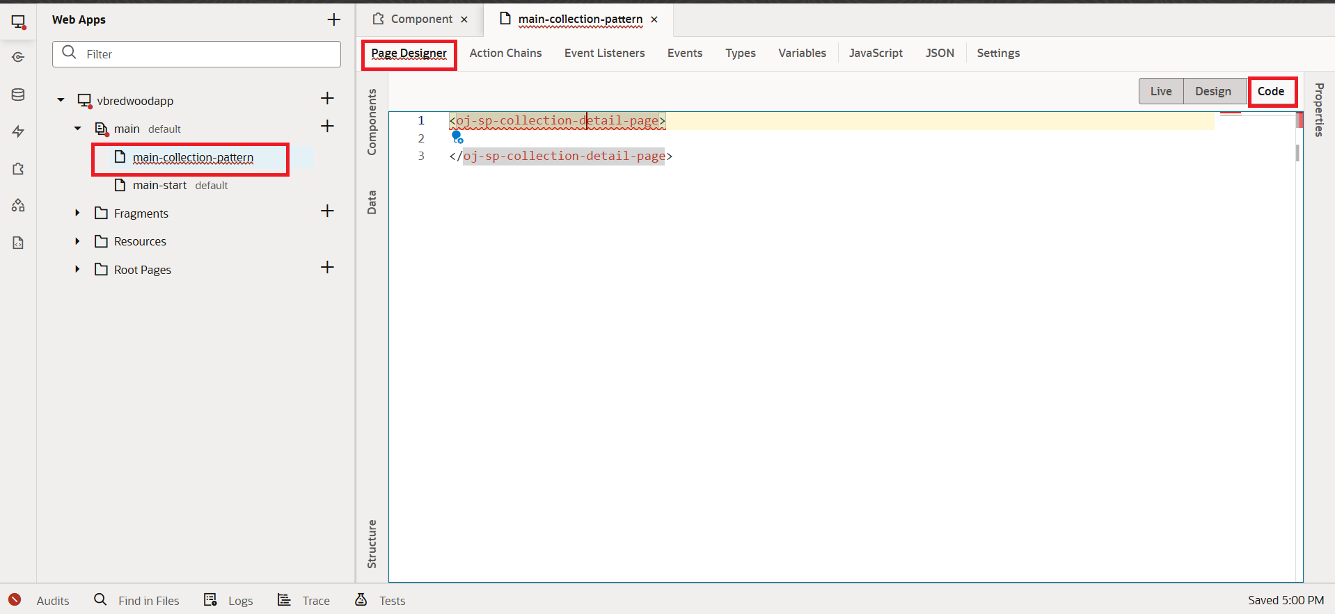
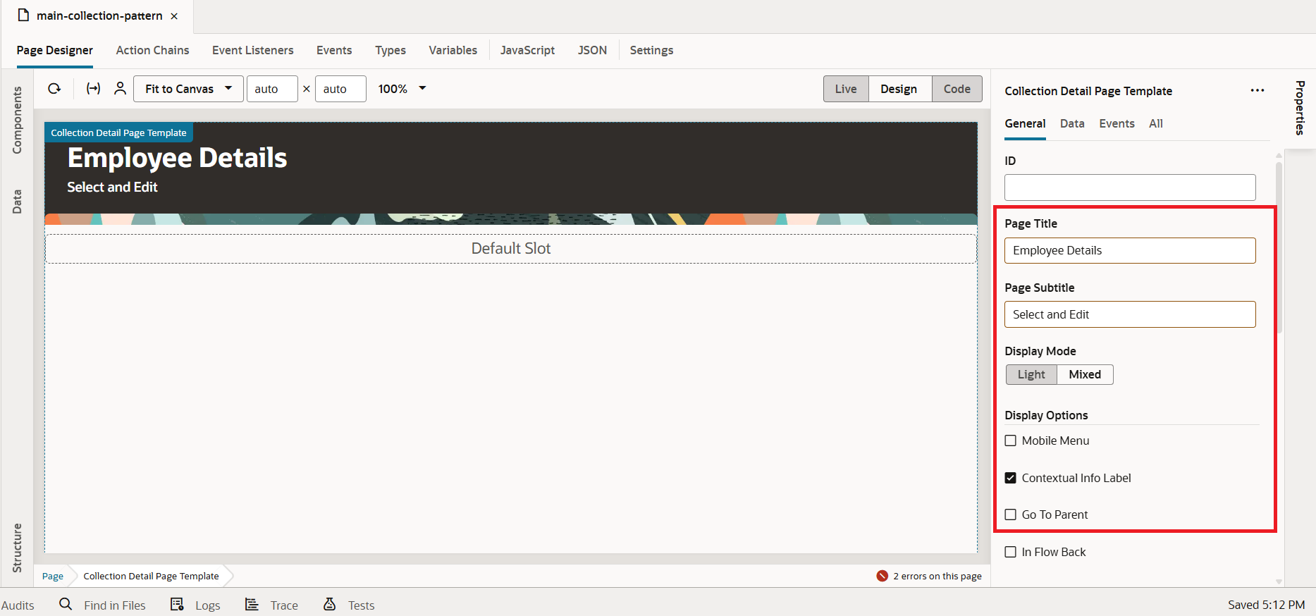
6. Now, lets add some basic template attributes like Page Title, Page Subtitle, Display Mode, etc as shown in the following screenshot:
 7. Now, drag and drop the Collection Container Advanced component from the Component Palette into the Design Area, as shown in the screenshot below.
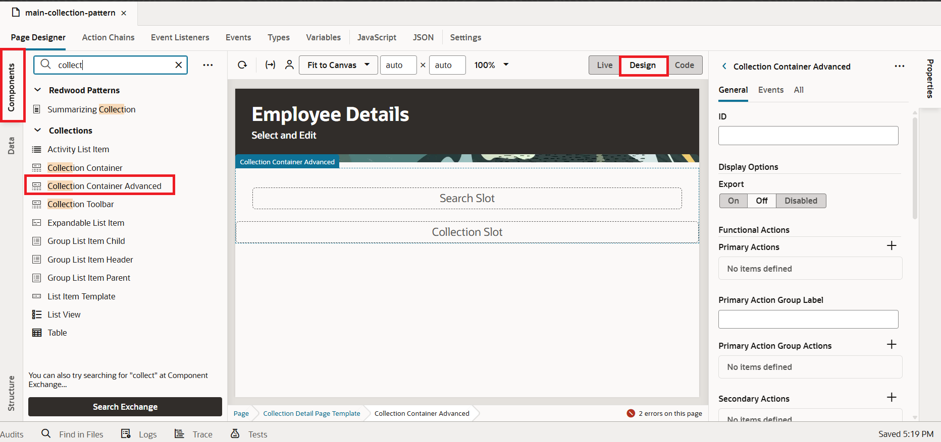
This will automatically provide both the search slot and the default slot for us.
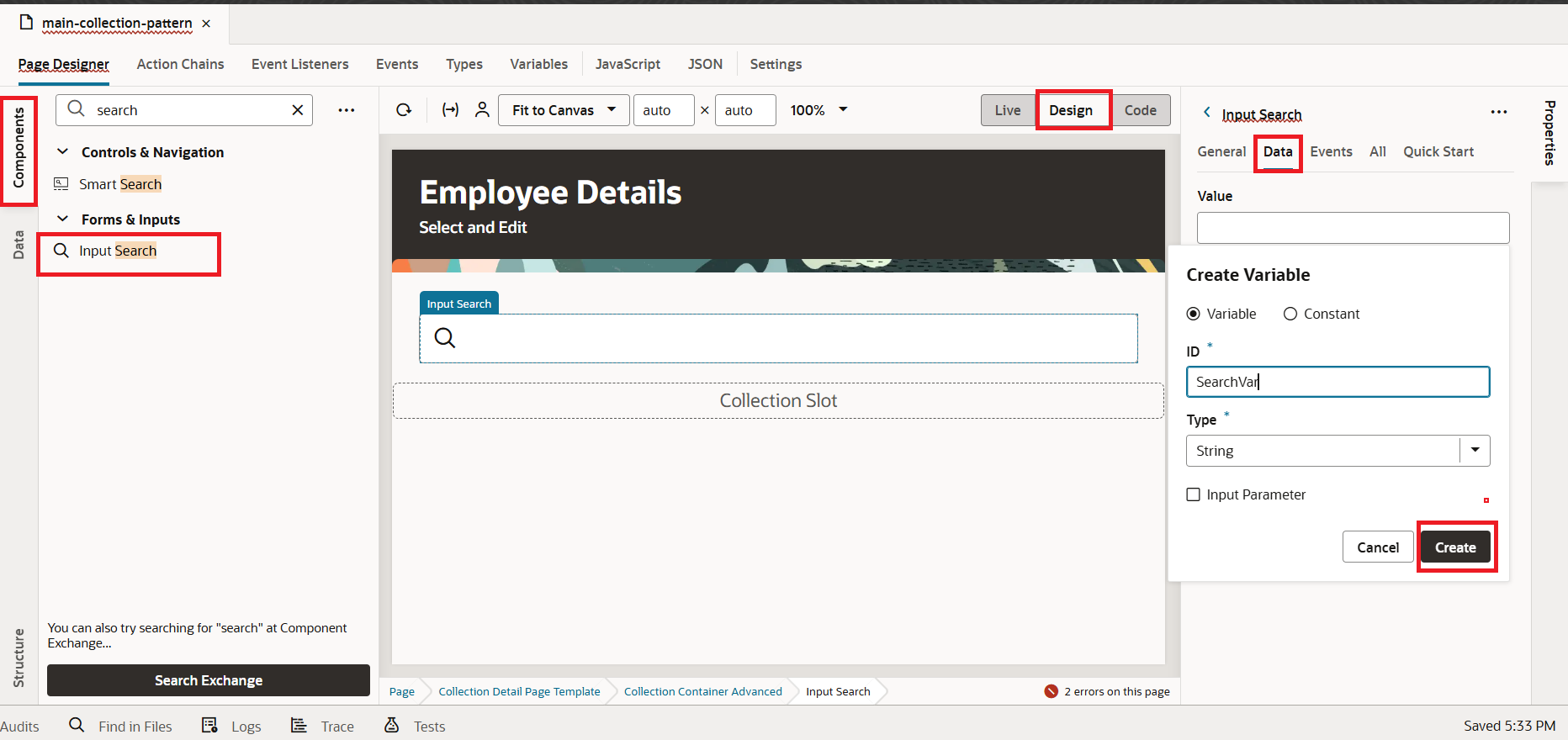
8. Next, drag and drop the Input Search component from the Component Palette into the Search slot of the Design Area, as illustrated in the screenshot below
Switch from the General tab to the Data tab. For the Value field, click on the Assign Variable button, then select Create, provide an ID, and finally click the Create button.
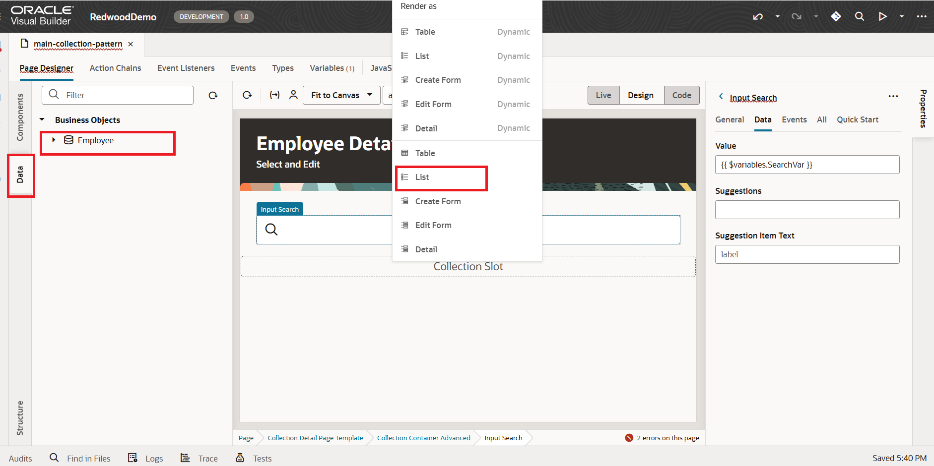
 9. For the collection slot, drag and drop the Employees BO under the Data pallet. You will then be prompted to choose a rendering type—select List, as shown in the screenshot below:
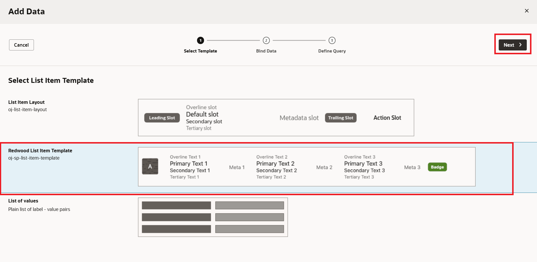
10. You will be prompted to choose a List Item Template. From the options, select Redwood List Item Template, then click the Next button, as shown in the screenshot below:
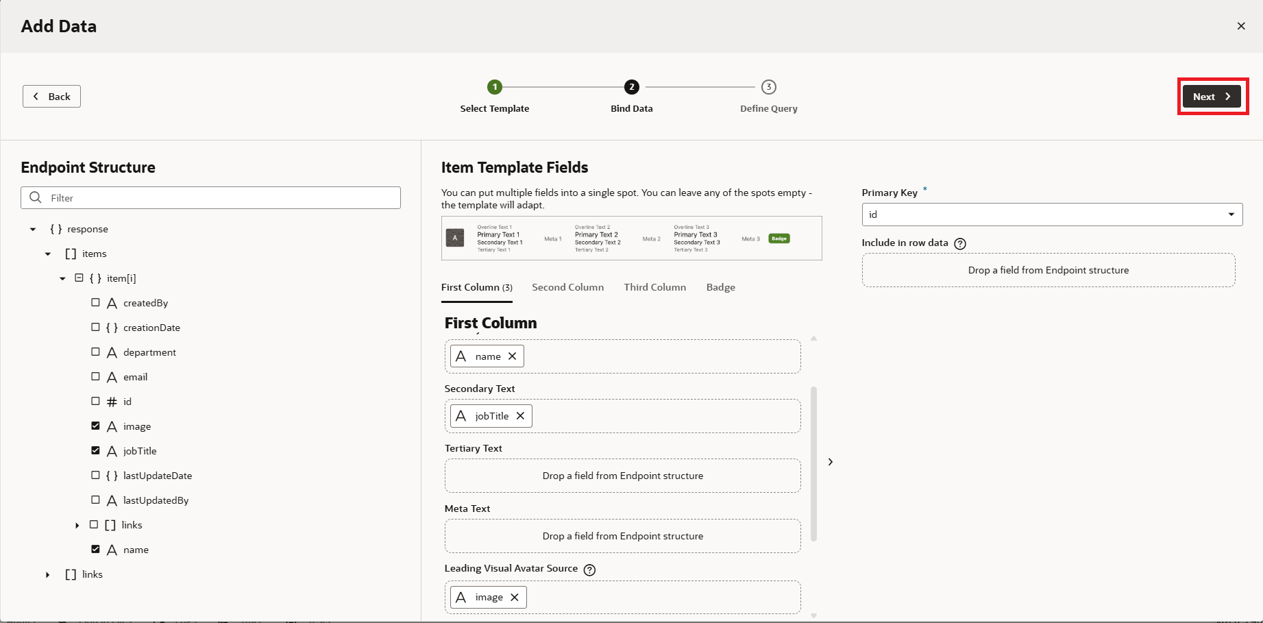
 11. Choose the fields you want to display in the corresponding column slots, then click the Next button, as shown in the screenshot below.
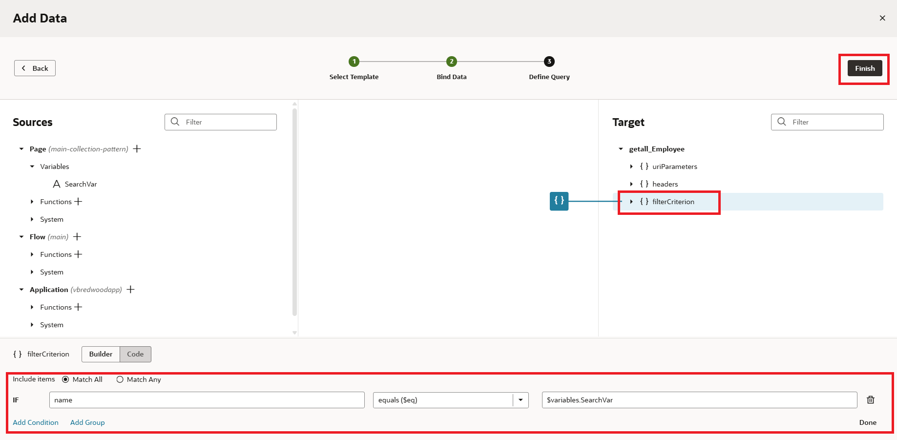
12. Click on filterCriterion, set a condition to link the search variable with the desired column so the data can be filtered based on the variable’s value, and then click Finish, as shown in the screenshot below:
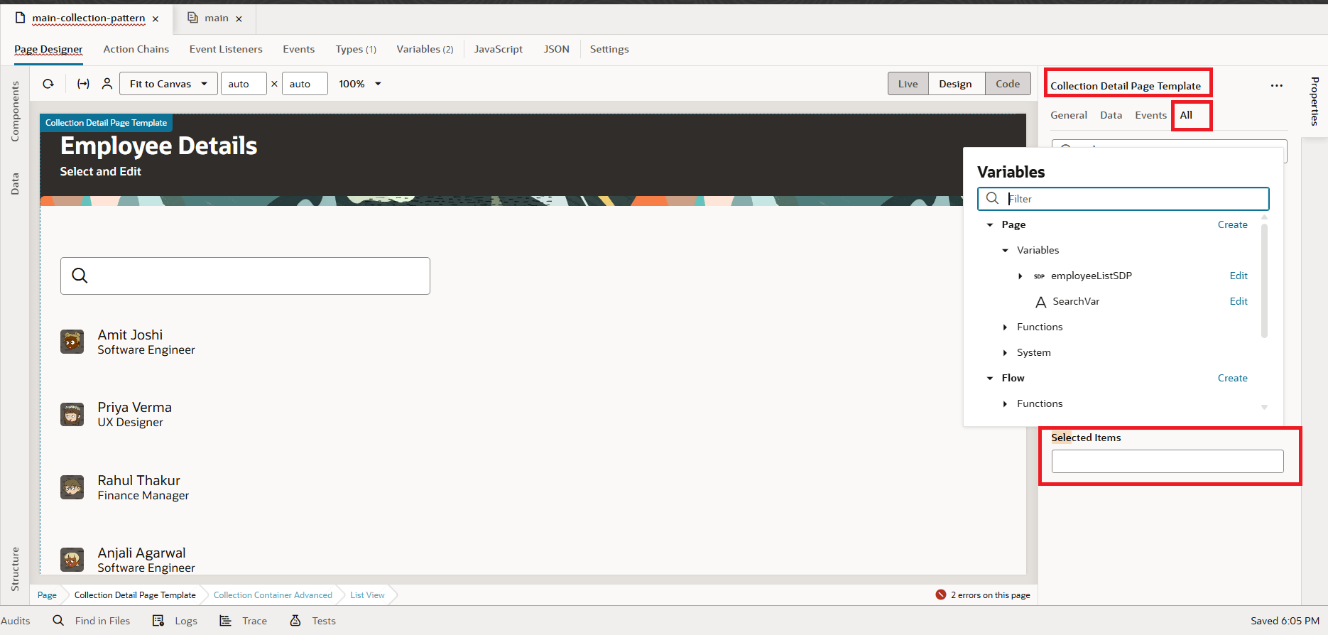
13. In the Collection Detail Page Template properties, switch to the All tab and search for Selected. Create a variable for Selected Items by clicking the Create button in the variable creation dialog, as shown in the screenshot below:
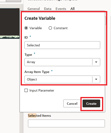
14. Click the Create button, enter an ID, choose the variable type as Array of Objects, and then click Create, as shown in the screenshot below:
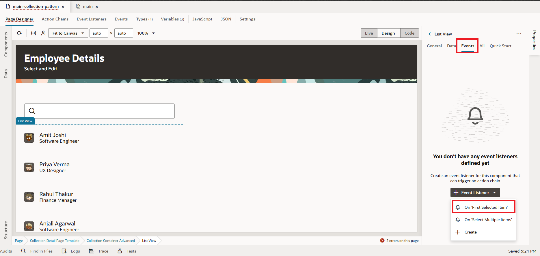
15. Now, click on the ListView component, go to the Events tab, and select the On First Selected Item event, as shown in the screenshot below:
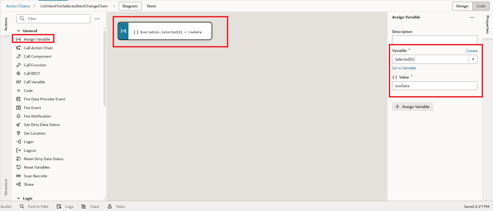
Drag and drop the Assign Variables action, then map the selected[0] to rowData, as shown in the screenshot below:
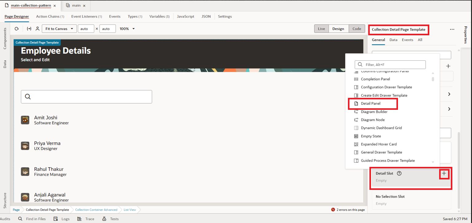
 16. Next, we’ll work on the Detail slot. In the properties of the Collection Detail Page Template, below the Default slot, locate the Detail slot. Click the + icon and choose Detail Panel, as shown in the screenshot below:
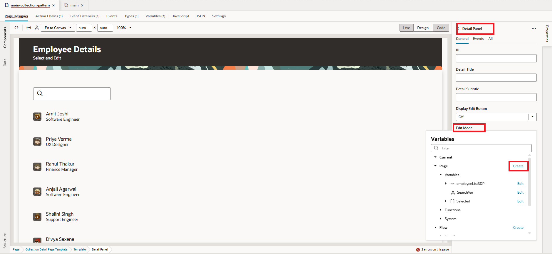
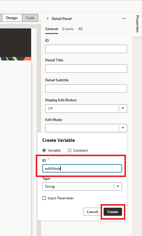
 17. Click on the Detail Panel, where you’ll see additional attributes such as Details Title, Subtitle, Edit Mode, and more. For Edit Mode, create a variable named editMode of type String and set default value as off to it, as shown in the screenshot below:
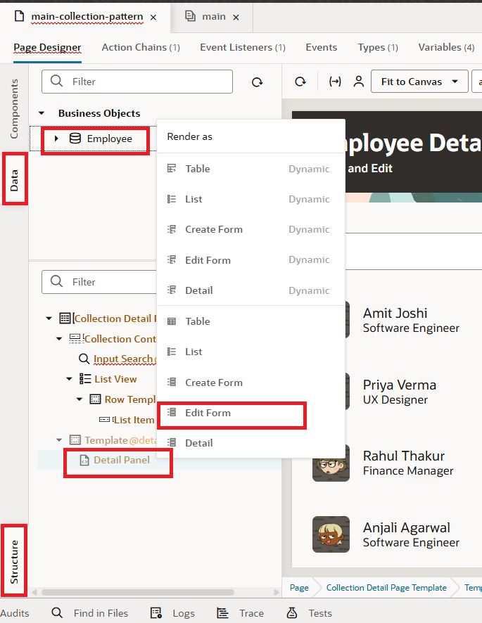
 18. From the Data tab, select Employee BO, then drag and drop it into the Detail Panel under Structure. When prompted, choose Edit Form, as shown in the screenshot below:
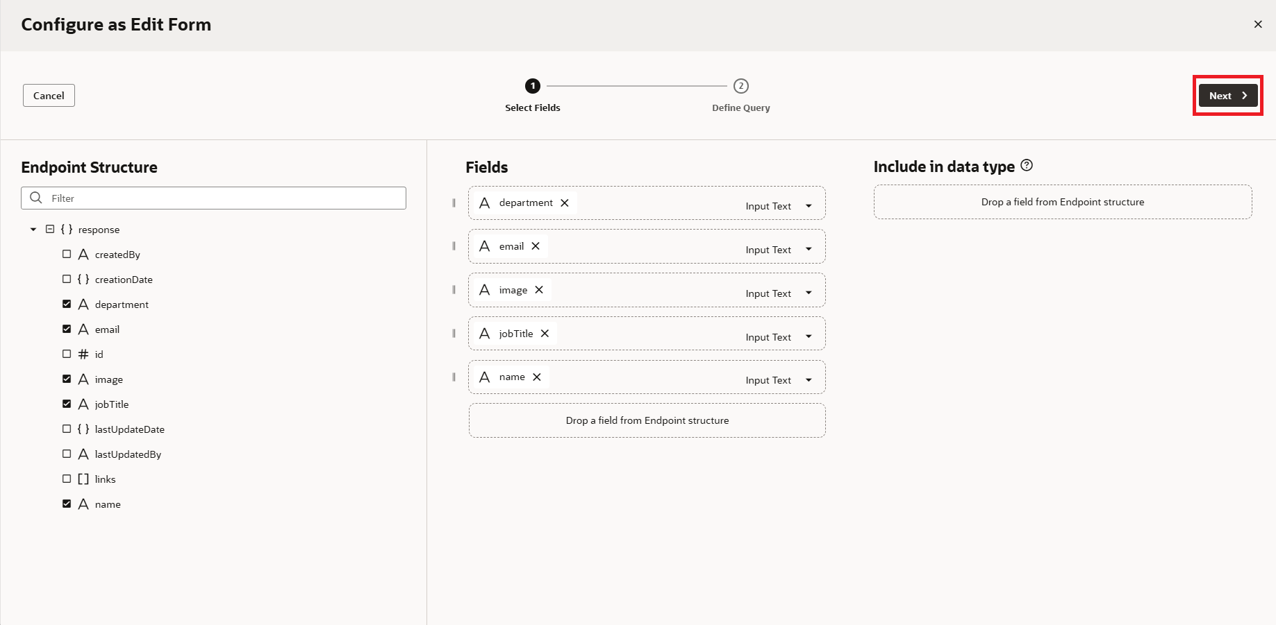
 19. Select the fields you want to make editable, then click the Next button, as shown in the screenshot below:
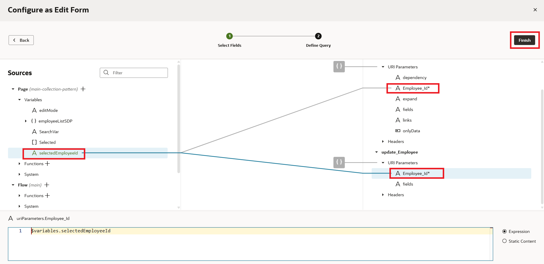
 20. In the next step, under Define Query, we need to map the Employee ID to update the specific record. To do this, click the + icon to create a new variable, provide an ID, and then click the Create button, as shown in the screenshot below:
 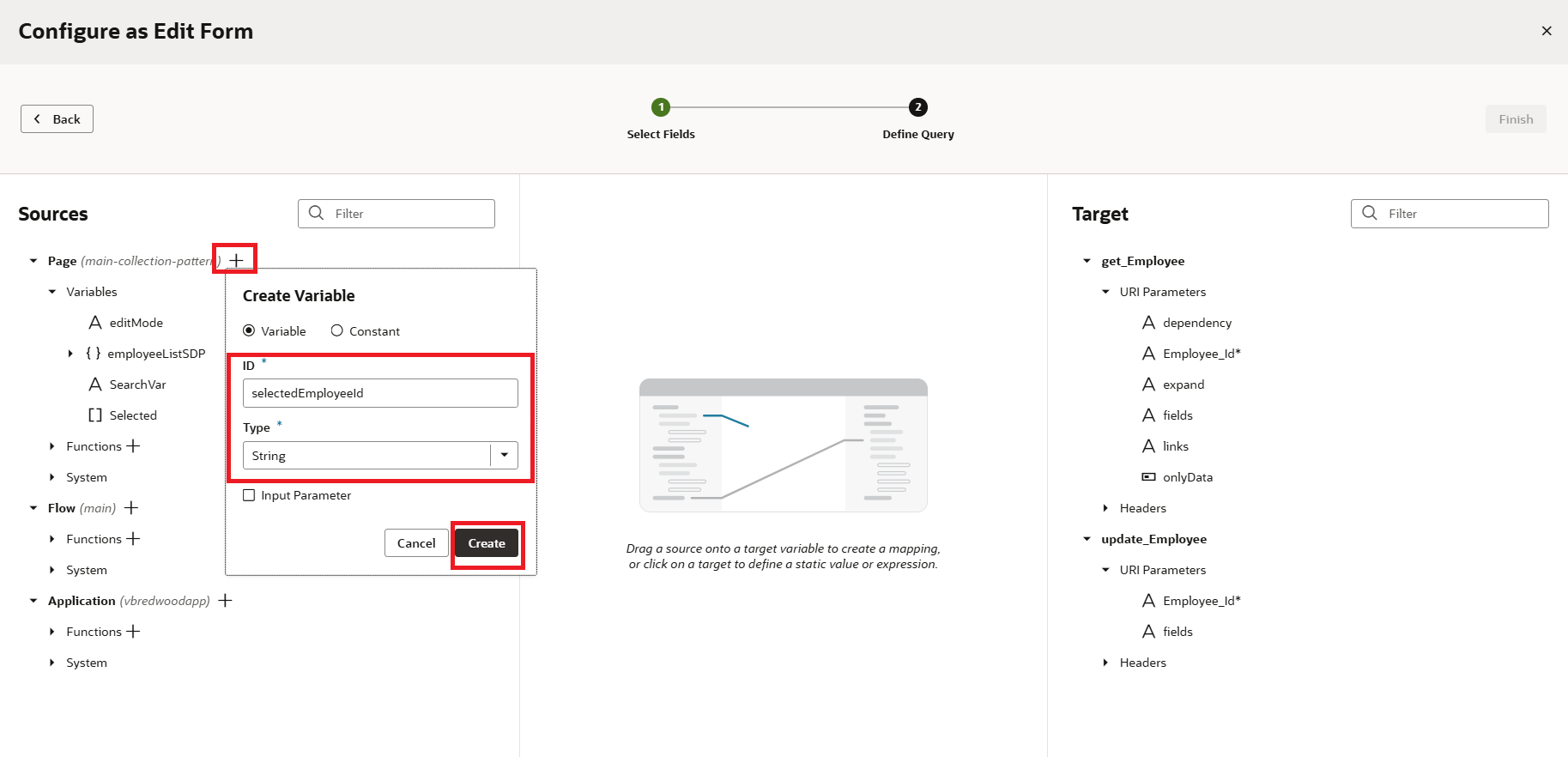 21. Now, map selectedEmployeeId to Employee_Id in both the GET and UPDATE URI parameters, and click on the Finish button as shown in the screenshot below:
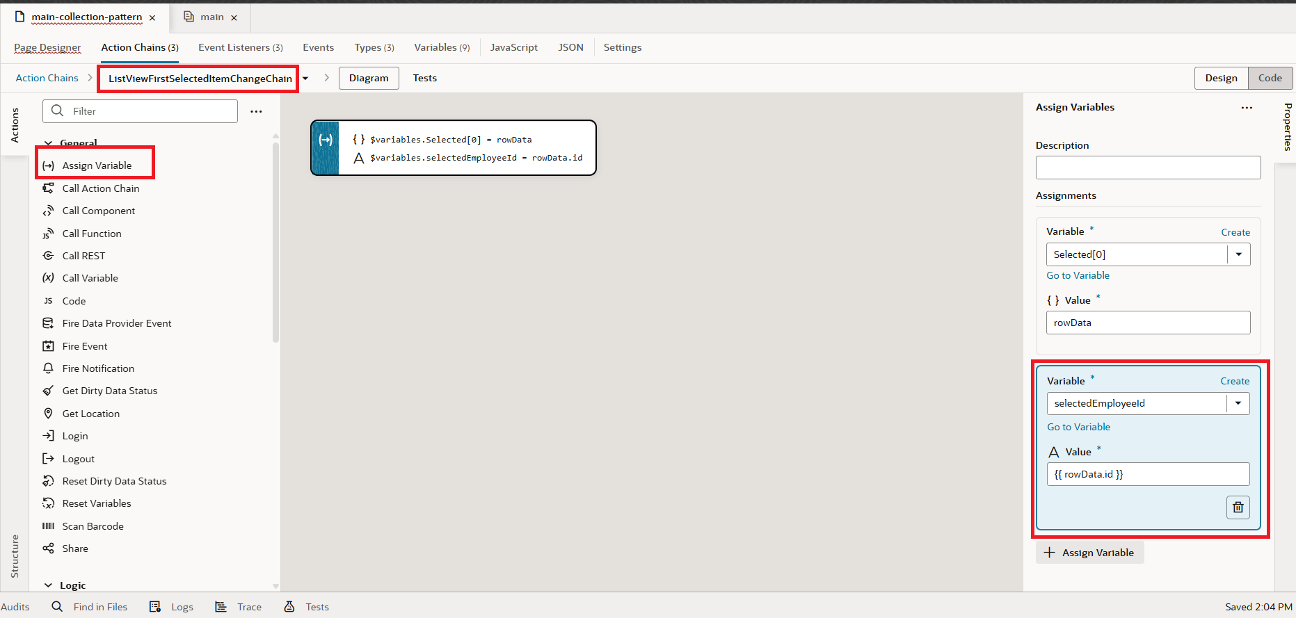
22. Since we haven’t assigned SelectedEmployeeID variable, we will now go to Event listener of the Listview, drag and drop Assign Variables Action, select the SelectedEmployeeID variable, and map the rowData.id as shown in the following screenshot:
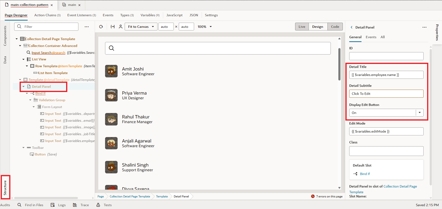
 23. Next, let’s configure a few more attributes for the form in the Detail Panel. Under Structure, click on the Detail Panel. Set the Title to employee.name (which was automatically generated during the Edit Form mapping). For the Detail Subtitle, enter Click to Edit, and switch the Display Edit Button option to ON, as shown in the screenshot below.
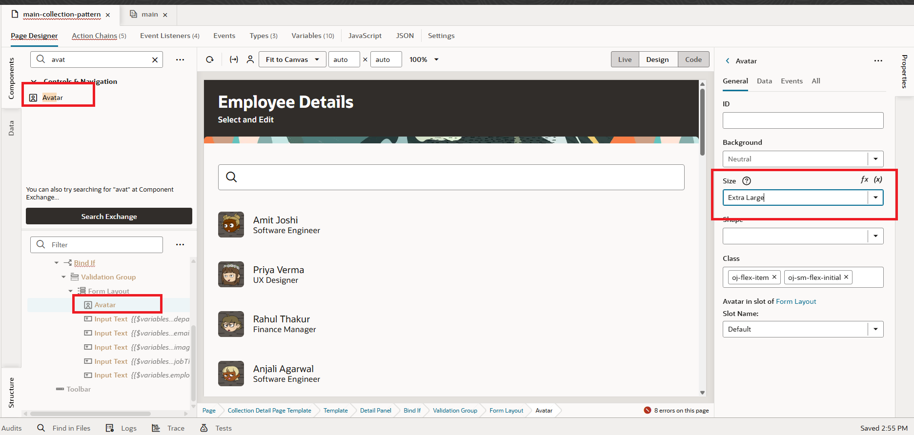
 24. Drag and drop the Avatar component from the Component Palette into the Form component, and set its size to Extra Large, as shown in the screenshot below:
In the Data tab, set the source value to Employee.image, as shown in the screenshot below: 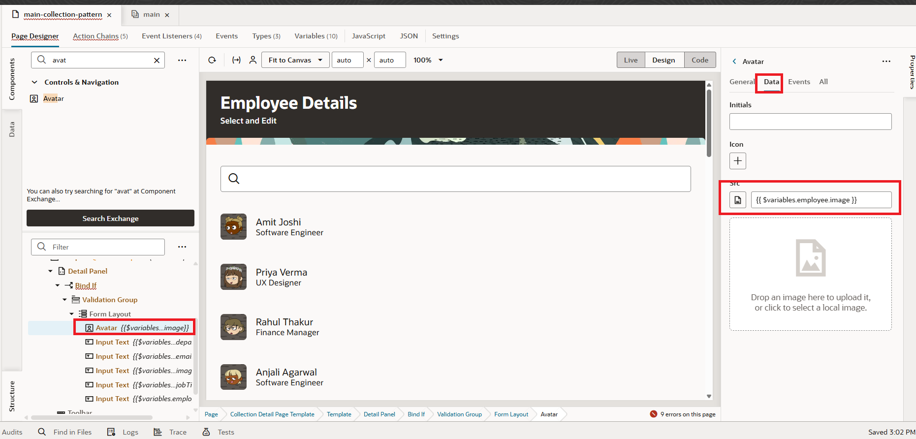 25. The configuration is done. When we preview the app and select an employee, a form appears that lets the user update details. But I want the form to be read-only by default and editable only when the user chooses to edit. To achieve this, I’ll create a new variable called readonly and set its default value to True, as shown in the screenshot below:
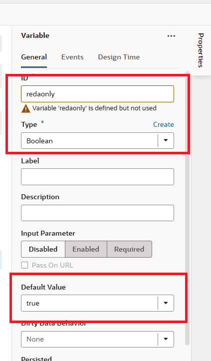
26. Go to the Form Layout and set the Readonly property to the variable we just created, as shown in the screenshot below.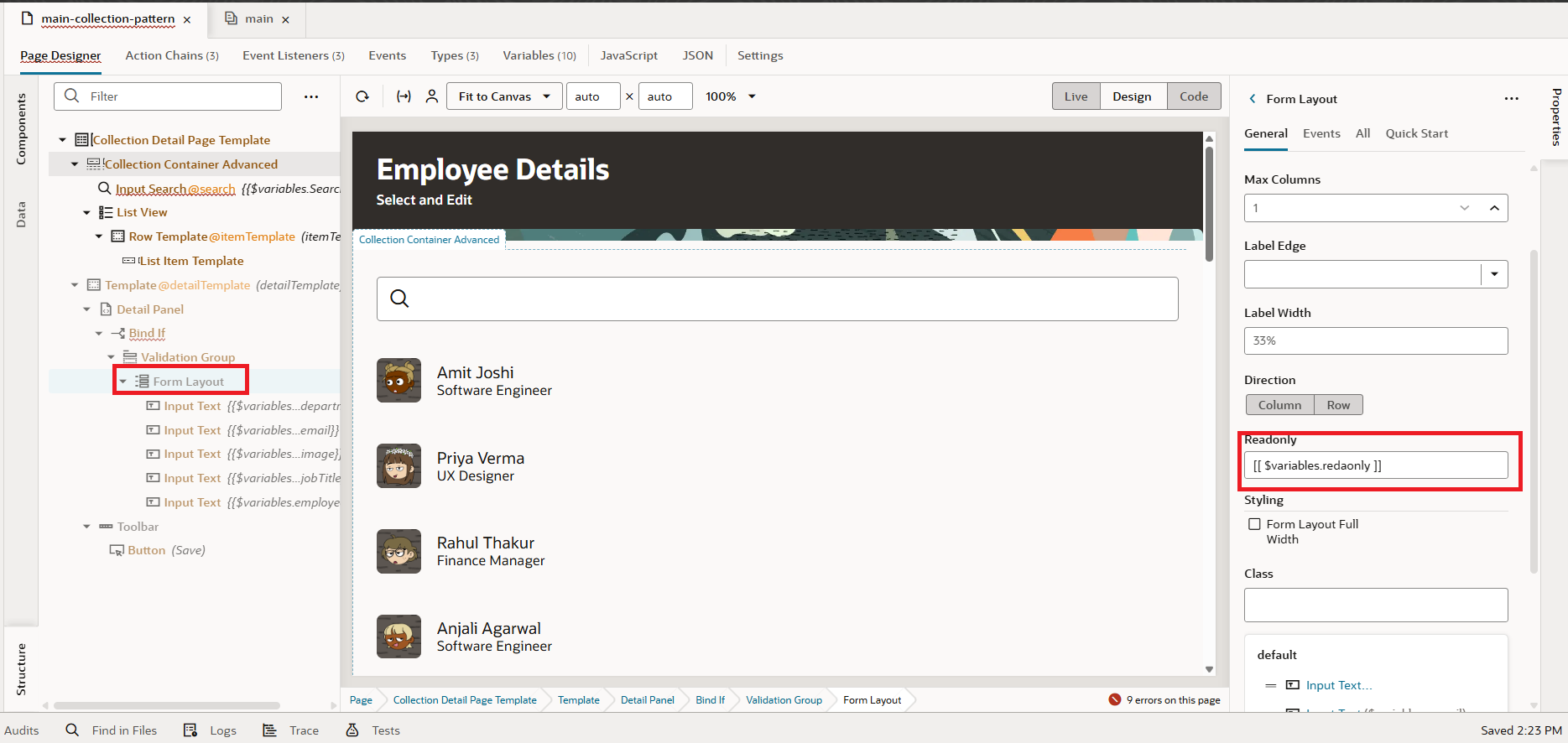
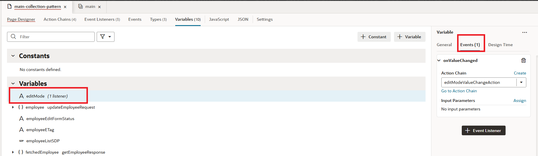
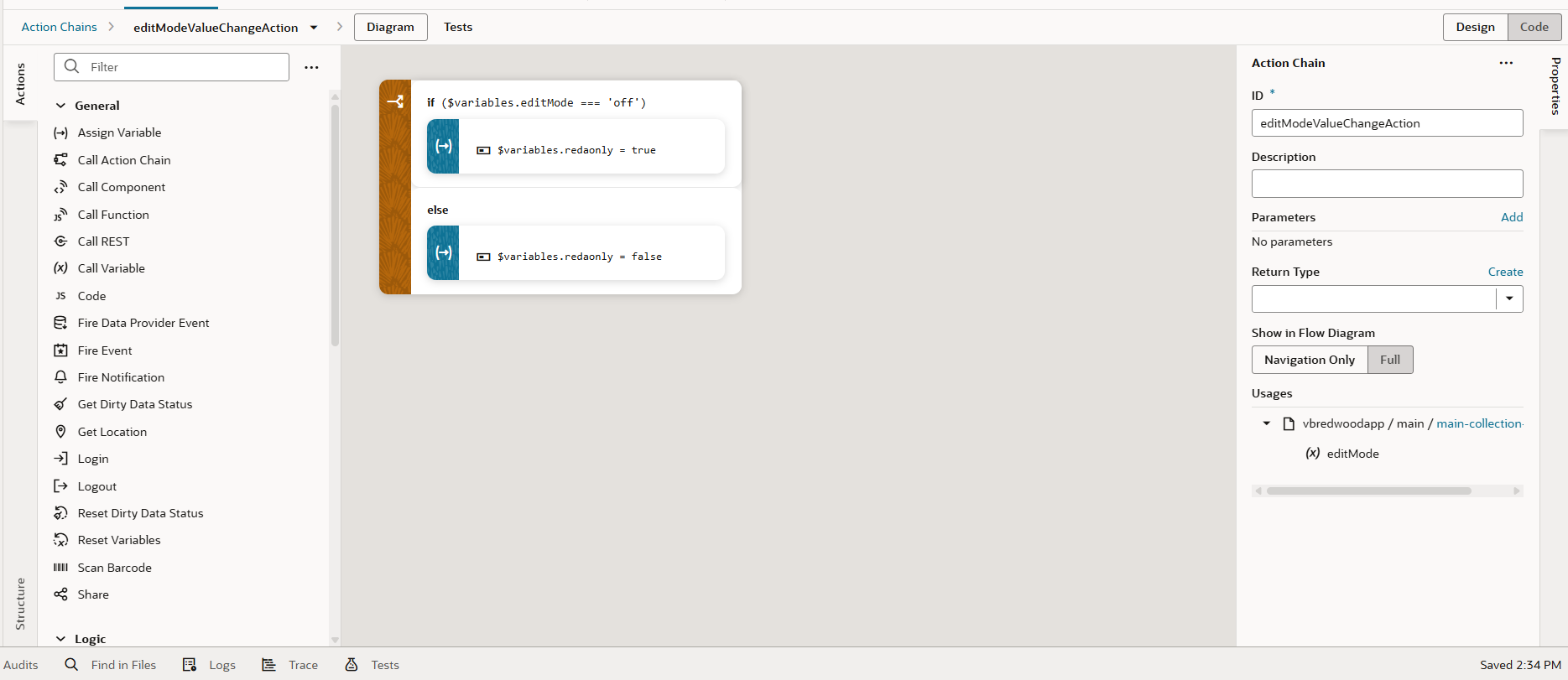
27. Now we need to link the readonly variable with the editMode variable since it controls the form’s state. To do this, go to Variables, select the editMode variable, switch to the Events tab, and click New Event, as shown in the screenshot below:
28.Drag and drop an If Action to the start node. Set the condition: if editMode = off, then set readonly = true; otherwise, set readonly = false, as shown in the screenshot below:
 29. You’ll notice a Save button is shown, but it isn’t needed. Let’s remove the button, but keep the action chain, since we’ll connect it to the Update button later.
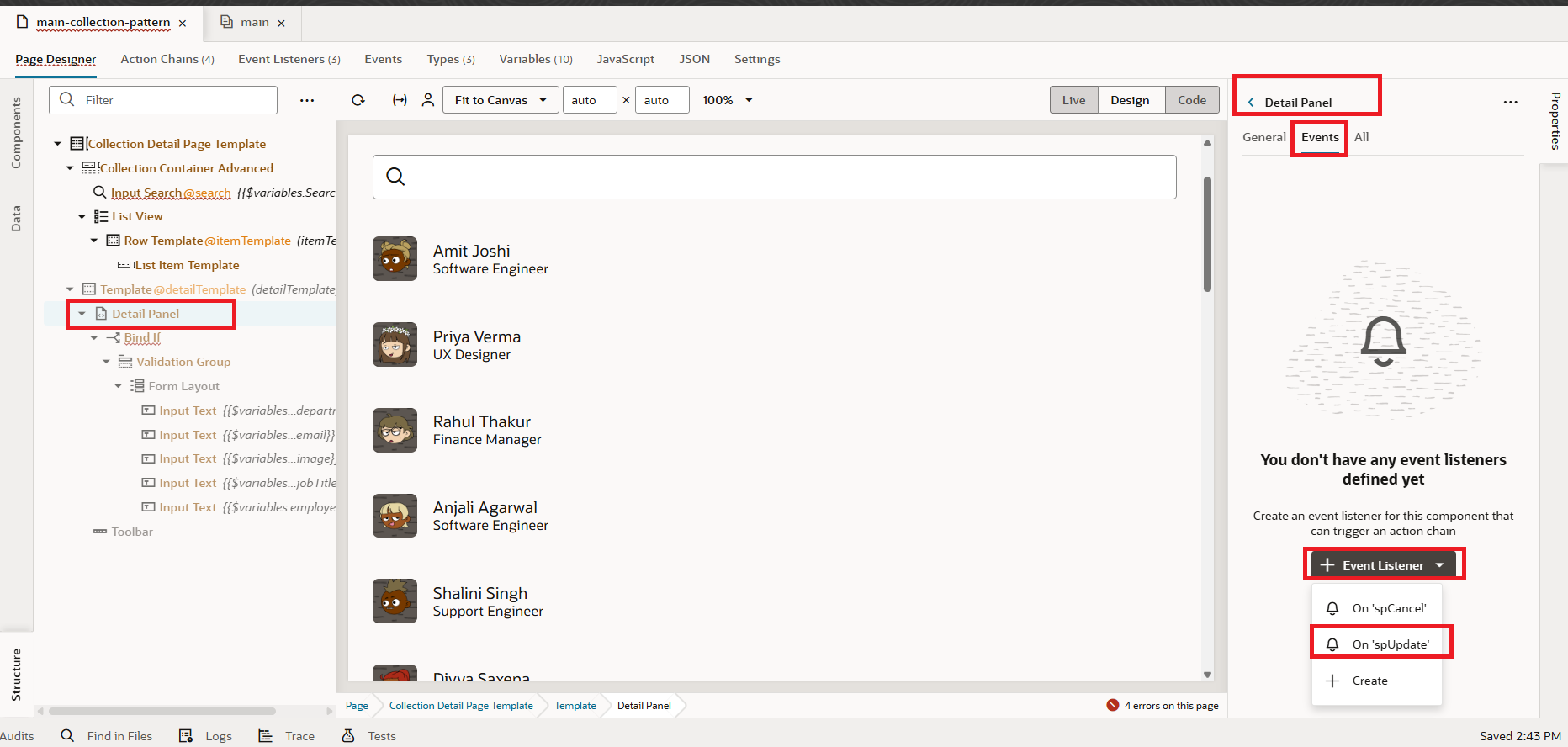
30. In the Structure, select the Detail Panel, then go to the Events tab. Click + Event Listener and choose on SpUpdate, as shown in the screenshot below:
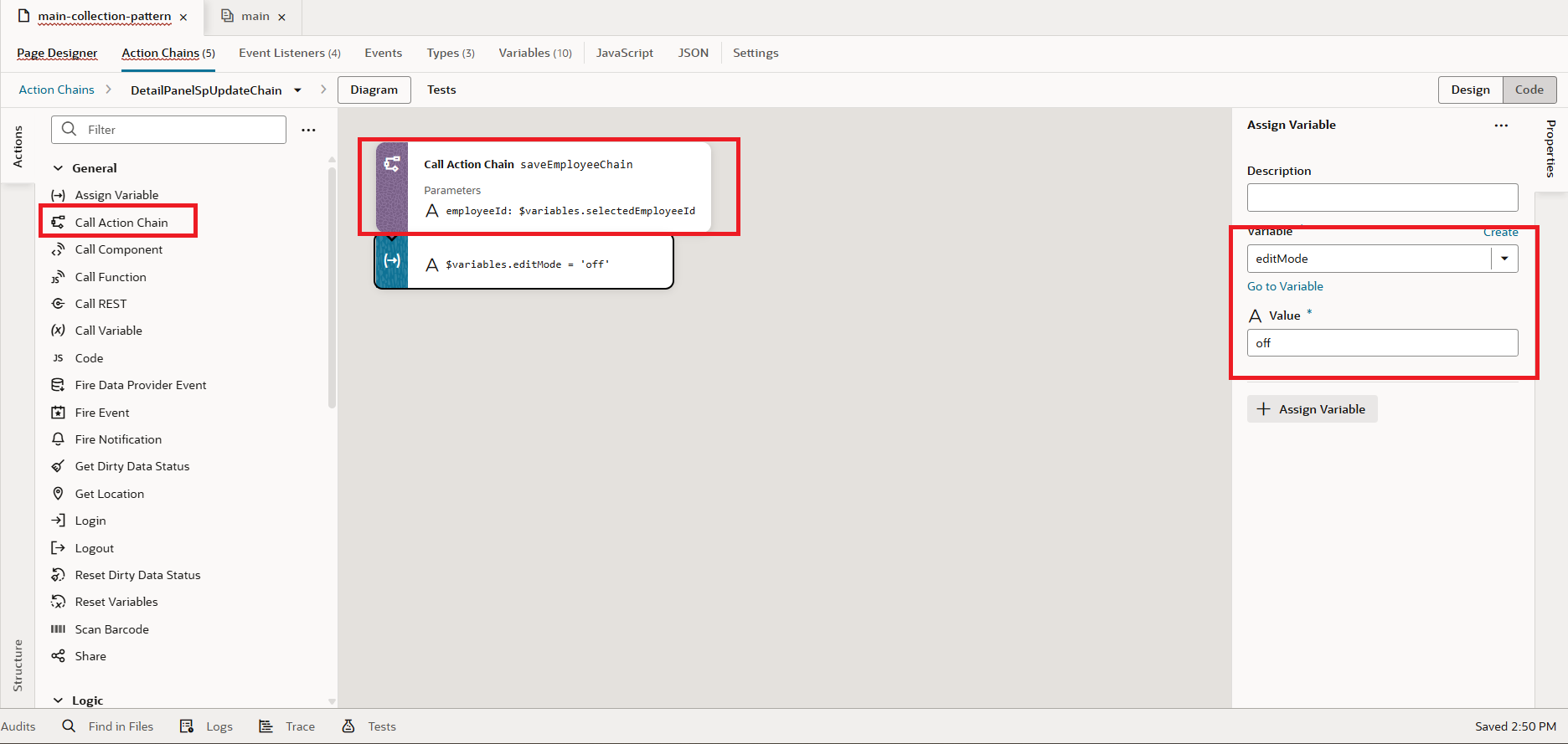
31. In the Action Chain, drag and drop a Call Action Chain action. Choose saveEmployeeChain as the action, map selectedEmployeeId to employeeId, and set editMode = off so the form returns to its original state, as shown in the screenshot below.
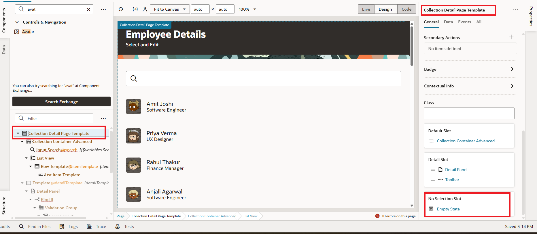
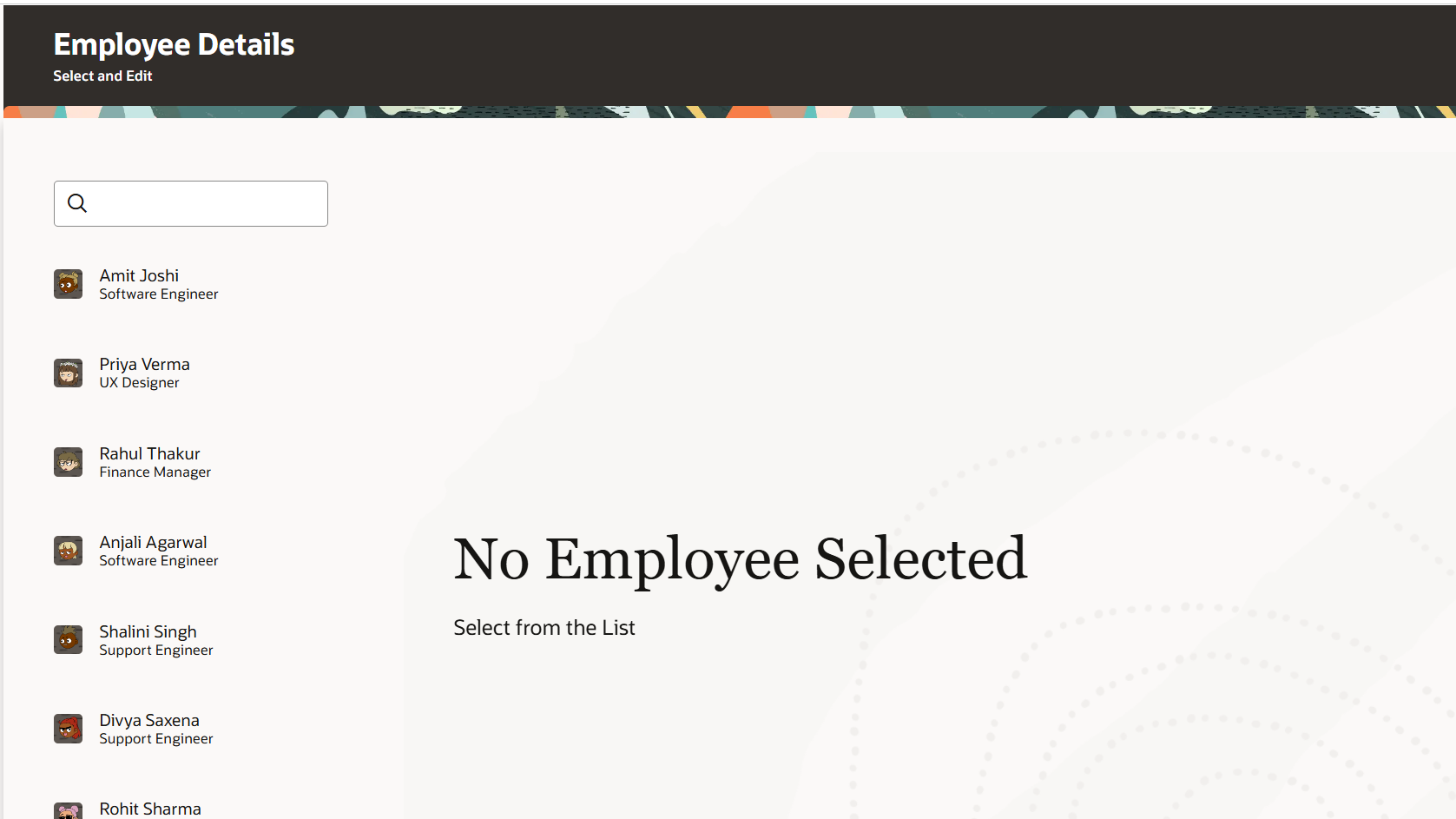
32. As a final step, let’s configure the No Selection Slot. In the Structure, select the Collection Pattern, click the + icon to add a template, and choose the Empty State pattern, as shown in the screenshot below.
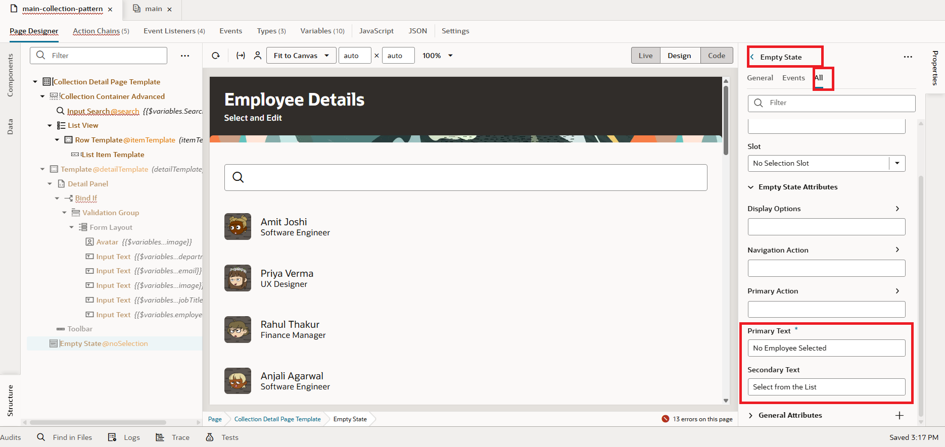
 33. Go to the Properties of the Empty State and enter values for the Primary Text and Secondary Text, as shown in the screenshot below:
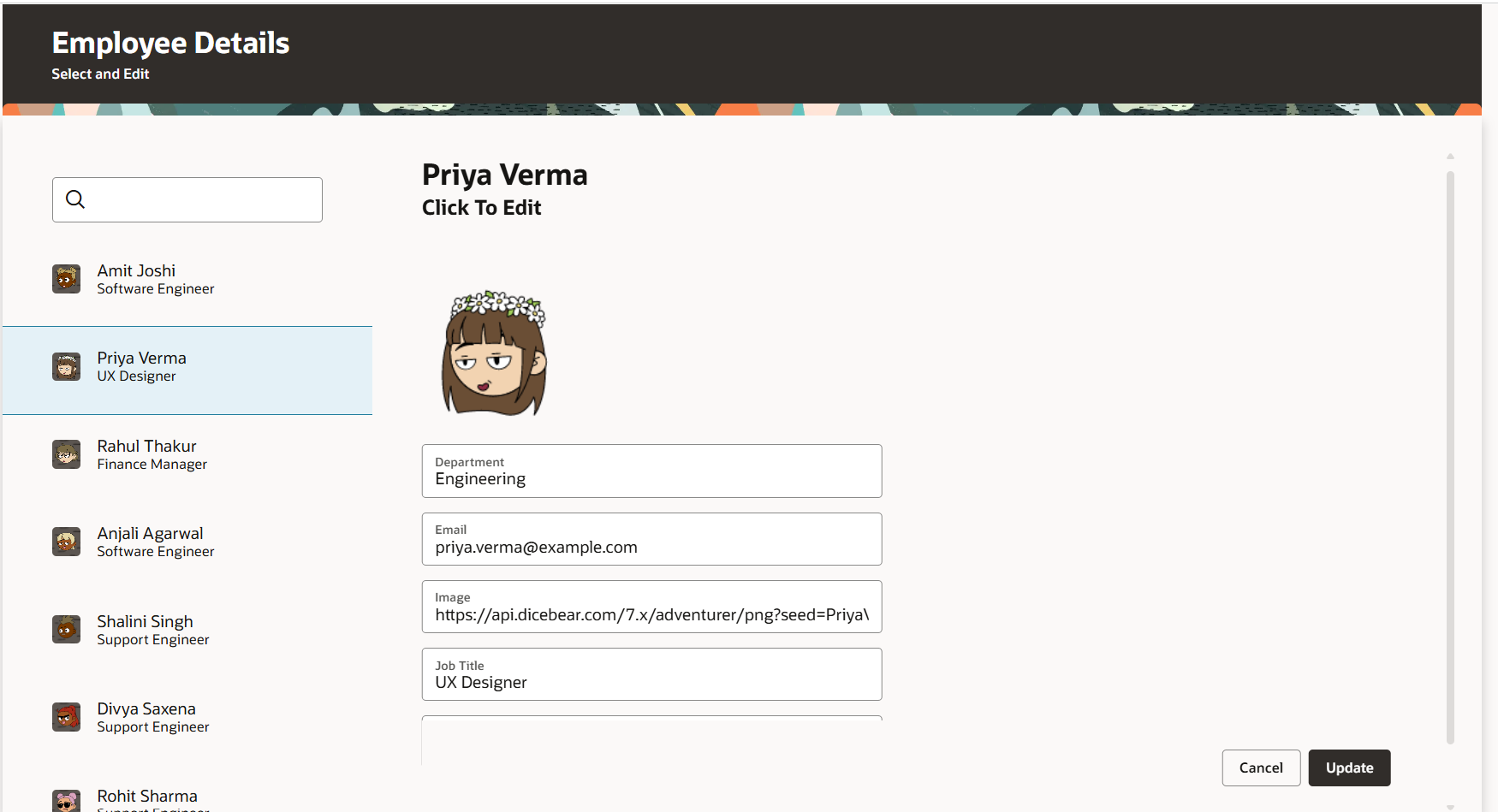
34. With this, our development is complete. Let’s preview the application and see it in action. On the left panel, you’ll find the list of employees, and when you select an employee, their details will appear on the right panel in read-only mode. By clicking the Edit button, the form becomes editable, allowing updates to the data. Once the changes are made, click the Update button at the bottom to save them.
This fulfills our requirement, and the final application will look as shown below:
This is how we work with Collection Details Pattern in Redwood using Oracle Visual Builder Cloud Service.
If you liked the article, please like, comment, and share


